Fonts & Artwork: The Personalization Studio
When we announced in 2005 that we could personalize our stock car magnets, the first question was always the same: "What will the lettering look like?" This page was the answer — the font and artwork library our art room used to turn a stock ribbon or ball magnet into something with your name on it.
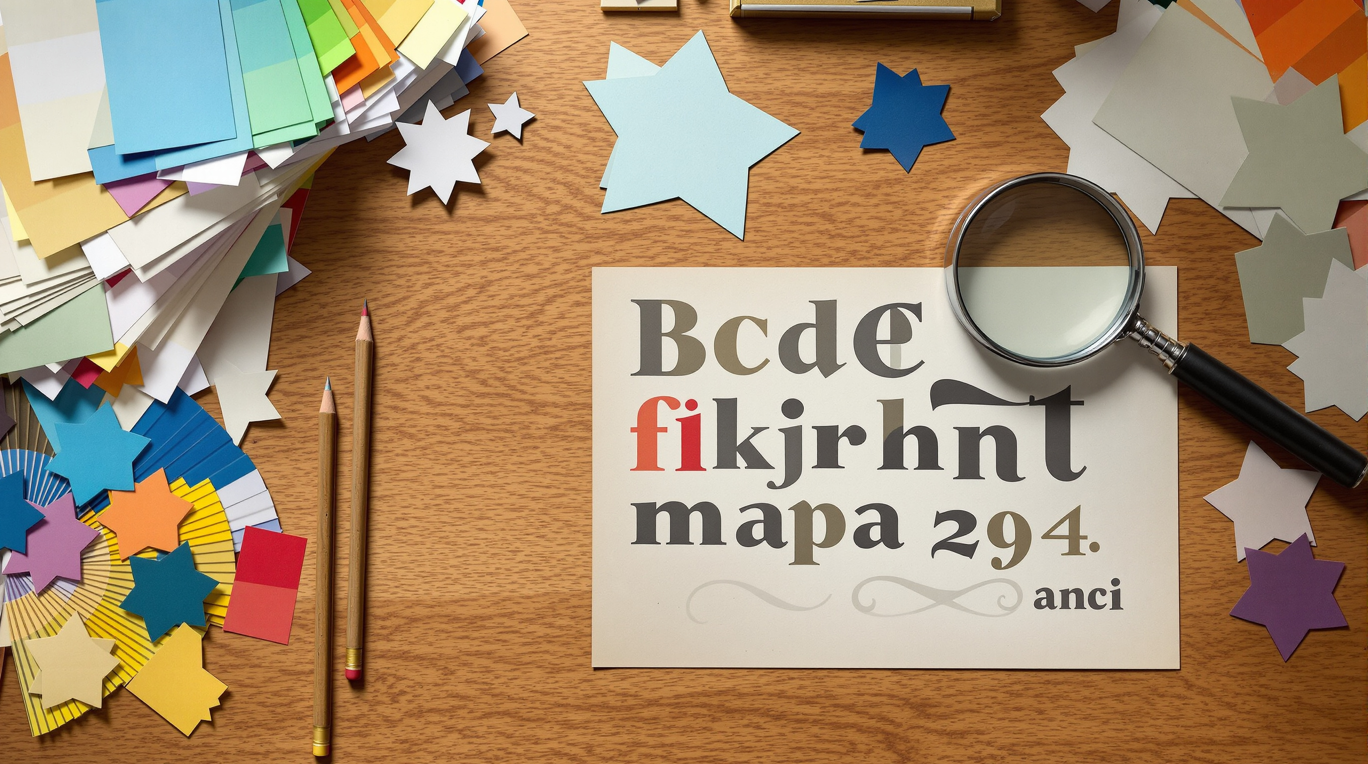
The Lettering Styles
The personalization library was built around styles that stayed readable on a moving vehicle:
- Block athletic — the varsity-jersey standard, perfect for names and numbers on sports ball magnets
- Classic serif — formal and dignified, the usual choice for memorial and tribute ribbons
- Script — warm and personal, popular for Keep My Soldier Safe style family ribbons
- Stencil military — the duffel-bag letterform, in steady demand for unit ribbons
- Collegiate arc — curved lettering that follows a ball's top edge or a ribbon's loop
- Rounded casual — friendly and modern, the favorite for school and church groups
Artwork and Embellishments
Beyond lettering, the art library carried the small graphics that finished a design: stars in every density, flag fields, crosses and fish emblems, paw prints, sports equipment silhouettes, awareness loops, flames and Maltese crosses for public service designs, and the camouflage and glitter-effect fills that customers loved on bracelets and ribbons alike. Supplied logos — school mascots, business marks — were redrawn cleanly for die-cut printing as part of every custom order.
Color Rules That Never Failed
Our art room matched lettering color to background using one rule: maximum contrast, tested at distance. Dark letters on light ribbons, light letters on dark, and never red-on-blue or blue-on-red without a white outline between them. Outlines and drop shadows weren't decoration — they were legibility insurance for a graphic read through a windshield at 40 miles per hour.
Typography Advice for Any Vehicle Graphic
The principles our personalization studio worked by apply to any sign or vehicle graphic, and design institutions like AIGA, the professional association for design, teach the same fundamentals: limit a design to two typefaces, size lettering for the viewing distance (one inch of letter height per ten feet of distance is the signmaker's rule), and give text room to breathe inside the die-cut shape. A personalized magnet with four words always outsold one with fourteen.
From This Page to a Finished Magnet
Personalization started with three choices: a stock design from the catalog, a lettering style from this library, and the words themselves. Our art room set the type, proofed it against the die-line, and sent the proof back before anything printed. The result was the best of both worlds — a proven design, made unmistakably yours. For projects that outgrew personalization, the next stop was the full custom guide.
Matching Style to Magnet Family
Twenty years of proofs settled into reliable pairings. Sports magnets wanted block athletic or collegiate arc — nothing else looked right above a jersey number. Family tribute ribbons split between script (for Keep My Husband Safe warmth) and stencil (for unit pride). Memorial ribbons took classic serif, full stop. Church groups gravitated to rounded casual for events and serif for scripture. Awareness ribbons mostly let the color talk and kept lettering minimal — a name, a year, a single word like Survivor. When a customer couldn't decide, our art room proofed the same words in two styles side by side, and the right answer was always obvious the moment the proofs sat next to each other.